InnerBlocks
What is InnerBlocks
An <InnerBlocks /> component can be used to insert an area inside a custom block where the user can insert other WordPress Core blocks or custom blocks that have been made for the site.
WordPress's documentation for InnerBlocks can be found here.
Note: Only one <InnerBlocks /> can be used per block.
When To Use InnerBlocks
When planning which blocks will be needed for a site from the design you should also consider what can be done already with what WordPress has built into the core. There is no reason to recreate the wheel with a paragraph block or a heading block when WordPress's core/paragraph and core/heading work perfectly. Similarly sometimes the design calls for block that has some custom design but within that custom design are elements that could be accomplished using WordPress Core blocks. For example:
In the screen shot above from a design file for a website we can see a block that requires some custom design to make it a full screen blue gradient background, but inside we can also see some content that looks like it can be accomplished with WordPress core blocks, such as the core/paragraph for the body text, core/buttons (see the section on Buttons to read more about how the core/buttons block can be styled to match the sites theme), and for simplicities sake we will also say we can use core/heading for the heading in the block (although this was not exactly the case for this specific block).
The index.twig file for the above block looked similar to the code below which has been edited slightly for simplicity:
<div class="global-padding py-[100px] !min-h-[calc((5rem*2)+20px)] blue-gradient text-white">
    <div class="mx-auto max-w-content">
        <InnerBlocks />
    </div>
</div>
The index.twig file above contains a div that is styled to appear as a full screen blue gradient background, another div inside to constrain the width of the content that will be put into the InnerBlocks to the sites content width defined in the theme.json and then the InnerBlocks itself.
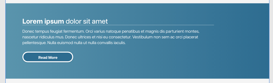
If you were to use this block in the editor, insert all of the content using WordPress's Core Blocks, and then view the code editor, it would appear like this:
<!-- wp:acf/one-column-content {"name":"acf/one-column-content", "mode":"preview"} -->
<!-- wp:heading -->
<h2 class="wp-block-heading"><strong>Lorem ipsum</strong> dolor sit amet</h2>
<!-- /wp:heading -->

<!-- wp:paragraph -->
<p>Donec tempus feugiat fermentum. Orci varius natoque penatibus et magnis dis parturient montes, nascetur ridiculus mus. Donec ultrices et nisi eu consectetur. Vestibulum non sem ac orci placerat pellentesque. Nulla euismod nulla ut nulla convallis iaculis.</p>
<!-- /wp:paragraph -->

<!-- wp:buttons -->
<div class="wp-block-buttons"><!-- wp:button -->
<div class="wp-block-button"><a class="wp-block-button__link wp-element-button">Read More</a></div>
<!-- /wp:button --></div>
<!-- /wp:buttons -->
<!-- /wp:acf/one-column-content -->
Where you can see that WordPress is handling wrapping the InnerBlocks content with comments to represent the start and end of the custom block and storing the information (core block types and the content used in those core blocks) that has been inserted into the editor for the custom block. It saves all of this information as the block posts content attribute which is what is rendered through the block render function.
This is much cleaner and more efficient than creating a block with ACF fields for the header, the button text, the button link, and the body text (which often when using big blocks of text needs to be a wysiwyg so that if there is a line break between paragraphs it is preserved, but also introduces other complications). It also offers a much better editor experience for the user as the text can be edited in place where it exists within the block rather than having to switch from the block preview to the fields or edit the fields in the side panel, and the user can see exactly how the amount of content they have inserted interacts with the custom block that it is contained within.
InnerBlocks and Patterns
Using a pattern within an InnerBlocks component expands the utility of using InnerBlocks tenfold.
Most atomic elements (with the exception of more interactive blocks such as sliders and counters) within a site design have a corresponding WordPress Core block, however the way that they are laid out often is what complicates the matter and dictates the use of a custom block.
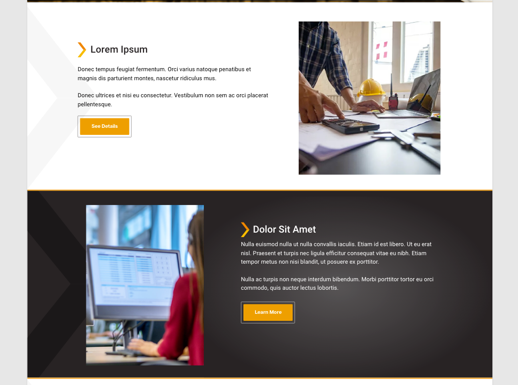
The block design in the image above contains two columns, one column that contains an image which can be inserted using core/image and the other column that contains a custom made 'Header with Icon' block, core/paragraph text, and core/buttons. It's conceivable also that the user might want to insert some other core blocks or custom blocks within this structure (you may see examples in a design to hint at this but even if there isn't it would be a reasonable assumption). Again, when we see many of these atomic pieces that already exist within Worpress Core, or that we have already made to be used in different places throughout the site, our first instinct should be to use InnerBlocks. It is probably possible to accomplish a block like this by solely using InnerBlocks and using core/columns however core/columns comes with some baked in breakpoints and other complications that give us a little less control over the customization of the block. The way this particular block was handled was through a pattern.
Making the Pattern
Patterns are made using the Pattern Manager plugin. Within the pattern post we would put all of the WordPress Core blocks or custom blocks that we want to appear in the default structure of the block.
For this particular block, since the picture could be in either the left or right column, the pattern was kept a bit more generic with an overall core/group to wrap everything, a core/group labelled left, a core/group labeled right, and some sample WordPress Core blocks put into both groups as default placeholders, the text of which implies to the user that they can change which blocks are in each column depending on what is needed (i.e. deleting everything in the left column to replace it with core/image).
It helps with CSS styling later to also use custom class names on some parts of the pattern template but its best to keep those class names on parts that you don't expect to be deleted from the pattern template by the user. For example in the pattern template above, custom class names were given to Left (.left-column), Right (.right-column), and the Content and Media Wrapper group (.wrapper) however the other parts were not given custom classes because they could potentially be deleted and replaced with other WordPress Core or custom blocks.
It is also good practice to rename core/group WordPress blocks so that a user knows what the group is when looking at the list-view of a page.
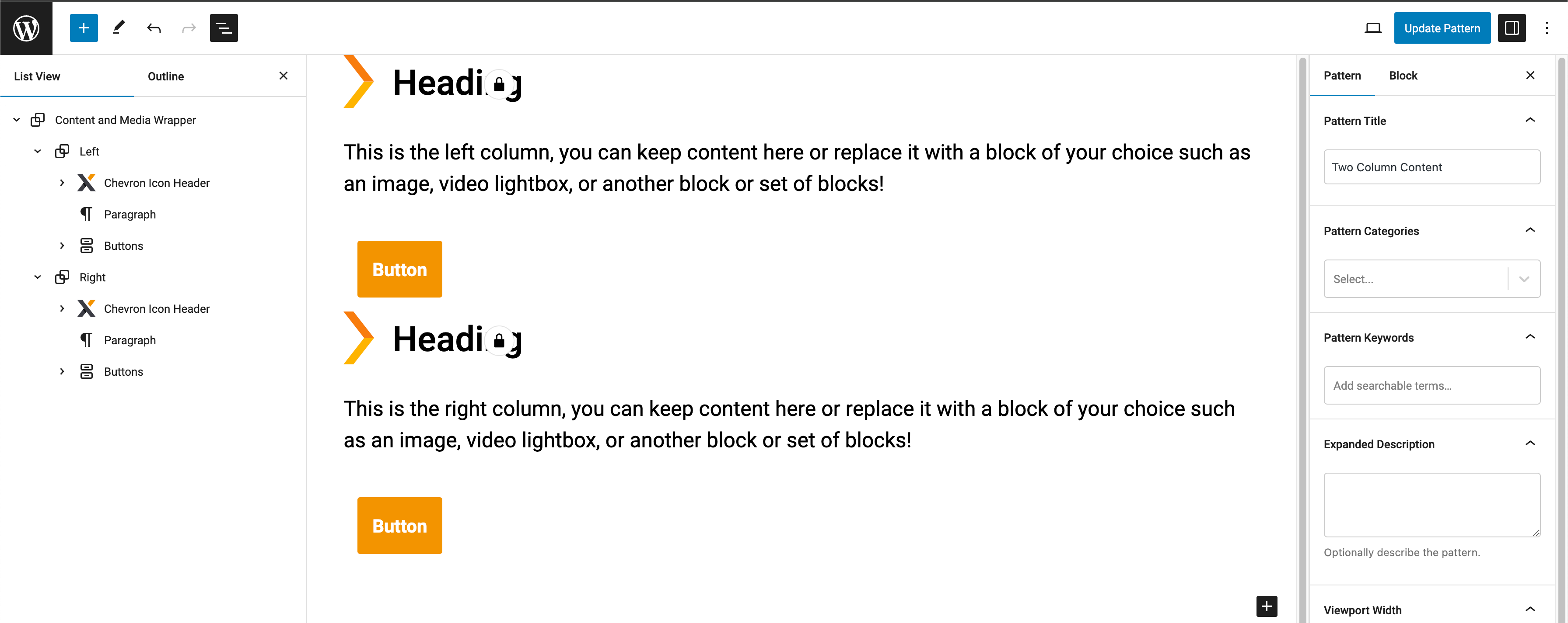
When you make a pattern in pattern manager, a file is created in your directory in the patterns folder. The pattern file is named as a slug of the pattern name. So if you named your pattern 'Two Column Content' the file would be two-column-content.php. The pattern file created for the pattern screenshot above looked like this:
<?php
/**
* Title: Content and Media Margin
* Slug: content-and-media-margin
* Description:
* Categories:
* Keywords:
* Viewport Width: 1280
* Block Types:
* Post Types:
* Inserter: true
*/
?>
<!-- wp:group {"className":"wrapper","layout":{"type":"constrained","justifyContent":"left"},"metadata":{"name":"Content and Media Wrapper"}} -->
<div class="wp-block-group wrapper"><!-- wp:group {"className":"left-column","layout":{"type":"constrained"},"metadata":{"name":"Left"}} -->
<div class="wp-block-group left-column"><!-- wp:acf/chevron-icon-header {"name":"acf/chevron-icon-header","data":[],"mode":"preview"} -->
<!-- wp:pattern {"slug":"heading"} /-->
<!-- /wp:acf/chevron-icon-header -->
<!-- wp:paragraph -->
<p>This is the left column, you can keep content here or replace it with a block of your choice such as an image, video lightbox, or another block or set of blocks!</p>
<!-- /wp:paragraph -->
<!-- wp:buttons -->
<div class="wp-block-buttons"><!-- wp:button {"className":"is-style-btn-1"} -->
<div class="wp-block-button is-style-btn-1"><a class="wp-block-button__link wp-element-button">Button</a></div>
<!-- /wp:button --></div>
<!-- /wp:buttons --></div>
<!-- /wp:group -->
<!-- wp:group {"className":"right-column","layout":{"type":"constrained"},"metadata":{"name":"Right"}} -->
<div class="wp-block-group right-column"><!-- wp:acf/chevron-icon-header {"name":"acf/chevron-icon-header","data":[],"mode":"preview"} -->
<!-- wp:pattern {"slug":"heading"} /-->
<!-- /wp:acf/chevron-icon-header -->
<!-- wp:paragraph -->
<p>This is the right column, you can keep content here or replace it with a block of your choice such as an image, video lightbox, or another block or set of blocks! </p>
<!-- /wp:paragraph -->
<!-- wp:buttons -->
<div class="wp-block-buttons"><!-- wp:button {"className":"is-style-btn-1"} -->
<div class="wp-block-button is-style-btn-1"><a class="wp-block-button__link wp-element-button">Button</a></div>
<!-- /wp:button --></div>
<!-- /wp:buttons --></div>
<!-- /wp:group --></div>
<!-- /wp:group -->
Note: You can use blocks that contain their own <InnerBlocks /> within a pattern. The pattern above contains two acf/chevron-icon-header blocks within it and each of those has an Innerblock pattern that uses core/heading as the pattern. This is the only way to get around the single InnerBlocks per block restriction.
The structure of the pattern is very similar to how the InnerBlocks were saved when looking at the code editor for a page using an InnerBlocks without a pattern. This is what will be inserted when a block with InnerBlocks using a pattern is dropped onto a page, and then anything that's within this (unless the template is locked) can be edited and changed by the user as needed before the blocks post content is saved.
Using the Pattern within the InnerBlocks
To insert an InnerBlocks component using a pattern you would use the format below:
Within the context of the example block that we've been working on it looked similar to the following (simplified for the examples sake):
<!-- This outer div sets some of the styling for the block based on fields -->
<div
    class="relative {{ fields.color_scheme == 'dark' ? 'bg-dark-grey !text-white border-t-[5px] border-b-[5px] border-orange' : 'bg-white !text-black' }} flex items-center overflow-hidden">

    <!-- This inner div contrains the width of the content that will be put into the InnerBlocks to the sites content width defined in the theme.json -->
    <div class="md:px-[var(--og--global-padding)] max-w-content mx-auto z-[1]">

    <!-- The InnerBlocks element itself can also have classes that assist with styling. In this case there was a field that could be used to dictate which order the columns stack in on mobile. -->
        <InnerBlocks
            class="{{ fields.top_mobile_stack == 'right' ? 'stack-right-top' : 'stack-left-top' }}"
            template="{{ get_pattern('two-column-content')|e}}" />
    </div>
</div>
Styling the InnerBlocks that use a Pattern
In our setup most of the styling can be accomplished within the index.twig using Tailwind CSS. However, the use of InnerBlocks is one case where we will not have access to put Tailwind styling classes onto the parts that are contained within the InnerBlocks. In this case we are going to turn to the style.css file for our block.
Note: Technically we do have access to putting Tailwind classes onto blocks that we use inside a pattern, and because the pattern file is saved in the theme directory the styles do get compiled by Tailwind, however, there are multiple reasons we shouldn't do this. First, if we needed to edit any of the styling, it would be easier to do so within our code. If we edited it within the pattern it would apply to all future uses of the block that uses that pattern, but anywhere the block was used before would need to be edited as well which is not ideal. Also, some of the blocks that we use within a pattern can be deleted by the user. Its best to not put classes that are vital to the appearance of the block in parts of the pattern that will potentially be deleted. That is why in the template pattern example further above I only put some classes that will ease in targeting those sections with CSS on the outer wrappers that were not as likely to be deleted by the user.
In our example block we gave the .wrapper class to the outermost group in our pattern. This will allow us to flex the content inside into a row (either through flex or grid, whichever suits the situation) and also handle when it should break into a vertical column, among other styling that needed to be done to complete the block. You can use @apply within the style.css file to use Tailwind classes rather than vanilla CSS.
Note: @apply works for applying all default Tailwind classes but if you want to use a utility class as an @apply, that class needs to be added to the tailwind.config.js.
The CSS for this block looked something like this:
[id^='two-column-content-block'] {
    .stack-left-top .wrapper,
    .stack-right-top .wrapper {
        @apply flex items-center pt-0 md:flex-row gap-[5%];
    }

    .stack-left-top .wrapper {
        @apply flex-col;
    }

    .stack-right-top .wrapper {
        @apply flex-col-reverse;
    }

    .left-column {
        @apply flex-shrink-0 w-full md:w-[55%];
    }

    .right-column {
        @apply flex-shrink-0 w-full md:w-[40%];
    }

    .left-column,
    .right-column {
        @apply md:py-[50px];
    }
}
The InnerBlocks component itself also comes with a class that can be targeted with CSS if necessary: